
Inside the Build:
The Email Design System Behind SERA Skincare
When I built out the email design system for SERA, I wasn’t designing emails for ecommerce. I was designing a sales team.
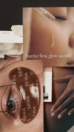
That distinction matters. An email design system for ecommerce isn’t a folder of pretty templates. It’s a structured, repeatable system your brand uses to move the right customer toward the right action, every single time you hit send. SERA is a minimalist DTC skincare brand built on a single positioning line: barrier first, glow second. Every element of the system had to earn its place by serving that idea.
Here’s how it came together.
Why SERA Needed an Email Design System, Not Just Emails
Most brands don’t have an email problem. They have a consistency problem.
They have a welcome email someone wrote two years ago. A promotional campaign that got designed in a rush. A win-back sequence that doesn’t match anything else in the inbox. And then they wonder why the numbers feel flat.
An email design system solves a different problem than individual emails do. It builds the foundation so that every email, whether it’s a launch campaign or a routine restock reminder, looks, sounds, and converts like it came from the same brand. Because it did.
For SERA, that meant building:
A modular Figma system with 12 to 16 reusable blocks. A set of fully constructed example emails showing exactly how the blocks combine. A strategic brief behind each email type with copy frameworks and subject line formulas. A short Loom walkthrough so the system is actually usable, not just beautiful and confusing.
The goal was a handoff that a founder could open on day one and understand. Not a file that required a designer to decode.
Why SERA Needed an Email Design System for Ecommerce
Every Inbox Edit system is built around modular blocks, not static layouts. That’s intentional.
Static email templates break the moment a brand needs flexibility. A block system doesn’t. Need a hero image one week and a bold text header the next? Swap the block. Want to add a testimonial to a promotional email? There’s a block for that. The system scales with the brand because it was built to be adapted, not followed like a script.
For SERA, the block library included:
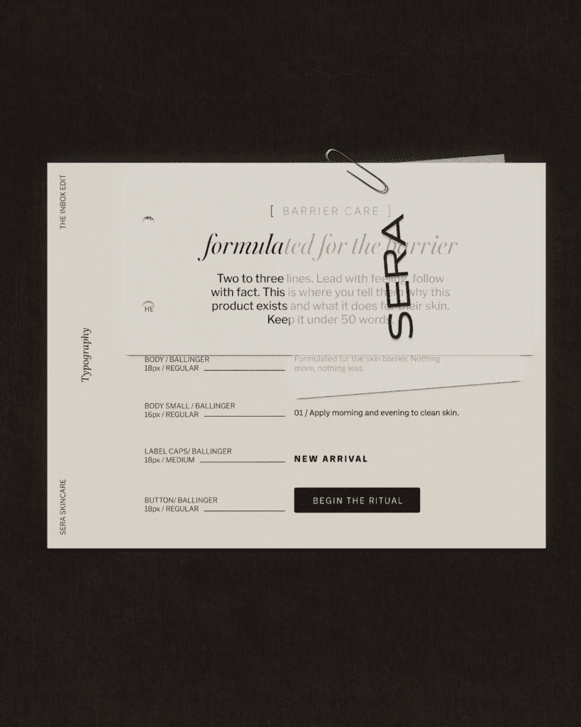
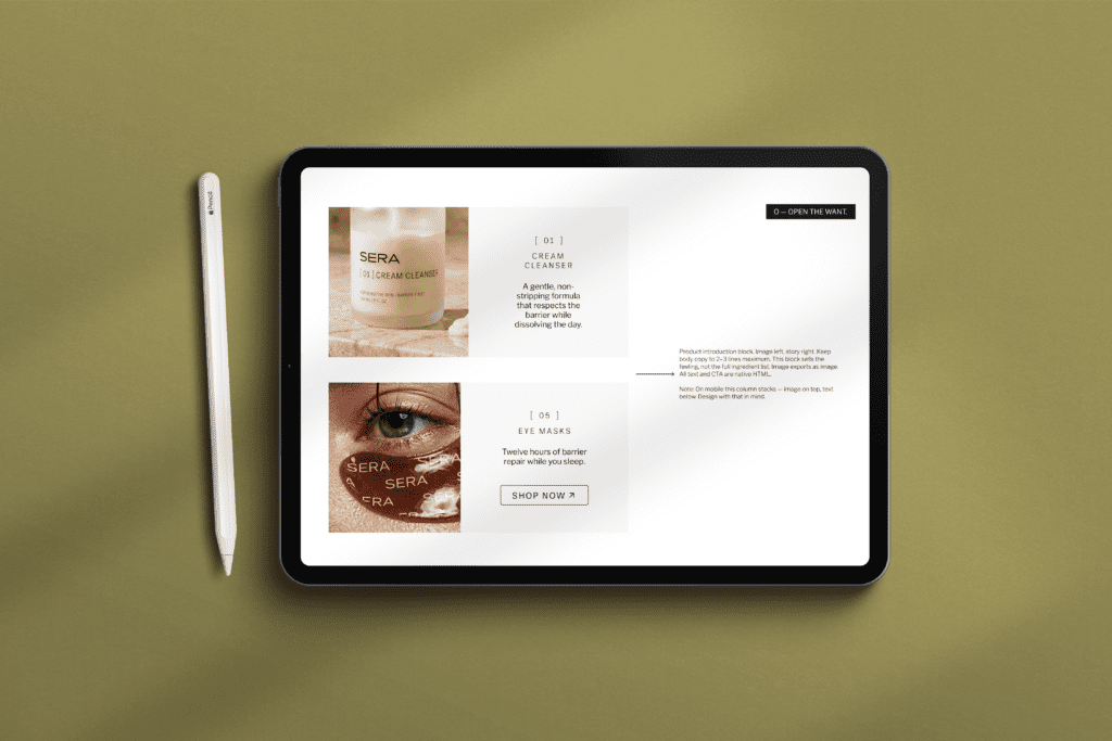
Hero blocks with both image-led and typography-led variants, calibrated to SERA’s dark, editorial aesthetic. Text blocks with copy frameworks already written into them, so the structure is never a blank page. Product feature blocks designed around the two-column format that works in skincare marketing. A pull quote block built specifically for single testimonials, not review grids. CTA blocks with button copy guidance and a clear hierarchy rule: one action per email.
Every block reflects SERA’s visual identity. But more importantly, every block reflects the STORY Framework.
Free Download
The STORY Framework
The five-step conversion framework behind every email system I build. Free, and worth bookmarking.
Download it freeThe STORY Framework in Action
The STORY Framework is the conversion methodology I use across every email system I build. It’s not a script. It’s a decision framework for information hierarchy. Each letter maps to a distinct job in the email.
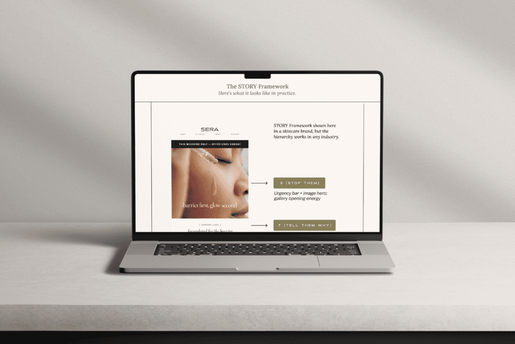
S: Stop them
Every SERA email opens with a hero that earns the read. For the hero, that meant choosing between urgency (a limited-time offer driving above-the-fold action) and atmosphere (an editorial image that drops the reader into the brand world). Both are valid. The system includes both. The subject line brief paired to each email type gives the formula for matching tone across the two.
T: Tell them why
One to two lines of context. Why this email, why now, why this customer. SERA’s single column intro block is built to do this job in 40 words or fewer. Not explaining. Orienting.
O: Open the want
This is where most ecommerce emails lose people. They jump to the product before selling the outcome. SERA’s product feature block leads with a feeling, not a feature list. “A gentle, non-stripping formula that respects the barrier while dissolving the day” is not a product description. It’s the outcome your skin wants.
R: Reassure
One proof point. SERA uses a single pull quote block here, styled to feel like a personal recommendation rather than a star rating wall. One real voice at the right moment is more persuasive than ten stacked together.
Y: Your next step
One CTA. One product. One price. The SERA CTA block is designed so there is no competing action on the page. The button copy isn’t “shop now.” It’s specific. It reflects what the customer just read and asks them to take the exact next step.
What It Looks Like When the System Works
A well-built email design system for ecommerce doesn’t just look good. It feels intentional.
When a customer opens a SERA email, they’re not confused about where to look or what to do. The visual hierarchy is clear. The copy does one job. The call to action is impossible to miss. That coherence is what converts.
More importantly, the system works without the designer in the room. The founder can build a new campaign by assembling blocks they already understand, writing into copy frameworks they already have, and following a subject line formula that’s already been tested. The system thinks with them.
That’s what The Inbox Edit delivers. Not just a beautiful email template. A system that converts while you sleep.
Thinking about what a system like this could look like for your brand?
The Inbox Edit starts at $2,400 and delivers in one week.
